Ditto party cup brand logo in circle over glitter background


Meson Technology / Ditto Brand Identity & Packaging

Double The Fun.

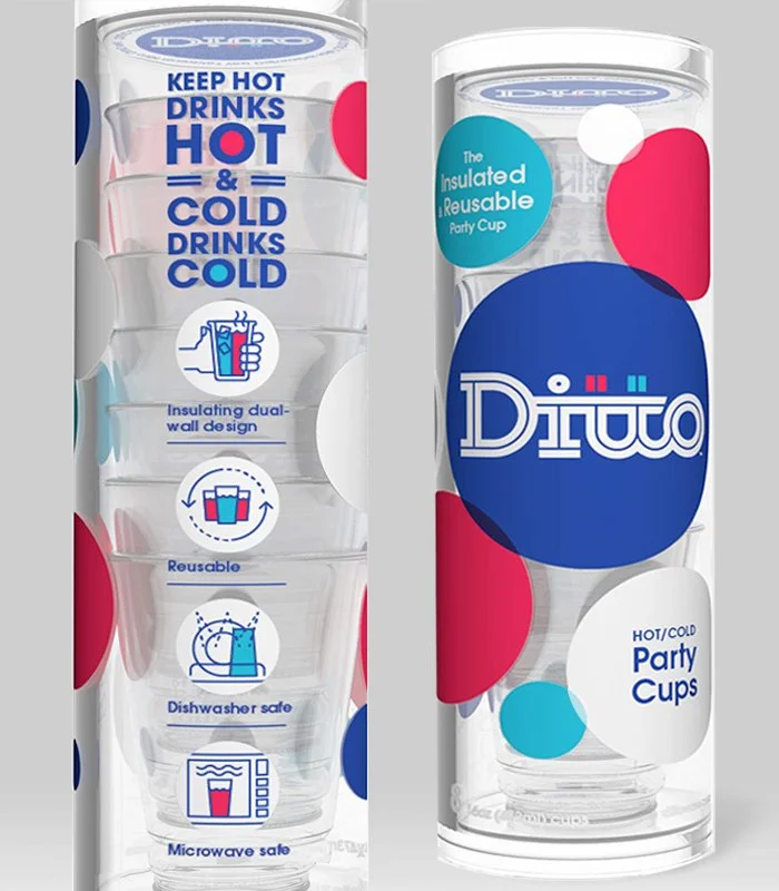
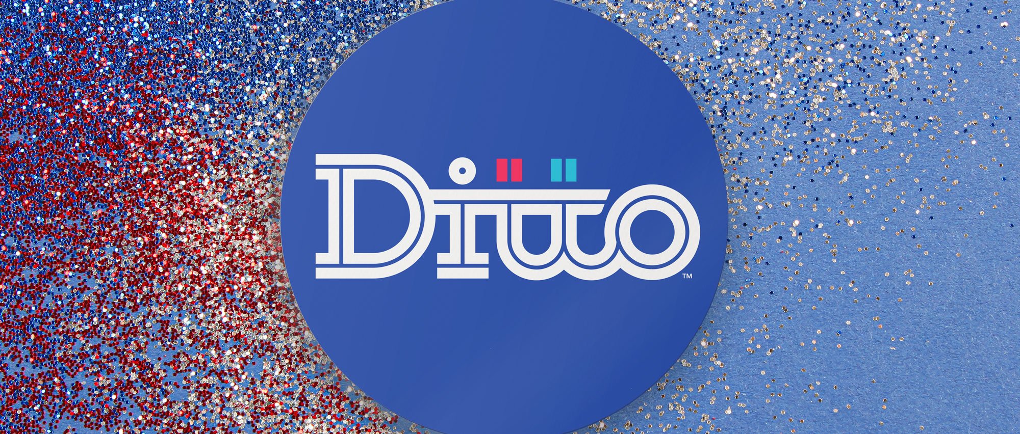
Ditto party cups come to party with a patented double-walled design that insulates your guests hands from hot or cold drinks, eliminating the need for wasteful paper sleeves. We teamed up with the product naming gurus at Pollywog to brand this next generation party animal from the ground up. The name, Ditto, is both fun to say and fun to look at. It plays on several levels: suggesting “double”, referring to the ditto mark, the insulating double wall of the cup, ability to work for both hot and cold beverages, and the fact that you can use the cup again and again. We brought that party to life with a logo and brand culture that celebrates the cup’s unique design, flexibility and durability. Even the package gets into it, not only communicating key product features and benefits, but also serving as handy storage between parties.


Work & Credits

Our Work: Visual Identity, packaging design

Naming Partner:
Pollywog Inc.


Ditto party cup diagram noting product features, including double wall design and dishwasher and microwave safe
Collage of Ditto visual identity and packaging concepts
Ditto brand primary logo design
Ditto primary dot logo
Ditto primary reversed dot logo
Ditto logo pattern
Ditto mark pattern
Ditto one color logo
Ditto primary reversed logo
Party goers holding up cups in a toast with an coastal sunset in the background

HOT or COLD drinks in the same cup.

Ditto party cup packaging graphics shown flat
Ditto party cup clear tube packaging with colorful brand graphics.
Front and back of Ditto party cup tube packaging
Top of clear tube Ditto packaging featuring dot logo and brand copy
Ditto cup brand copy and photo featuring cups of hot and cold drinks
 

Related Work


Meet Your Makers.

Power For The Long Haul.

 
Previous
Previous

Power For The Long Haul.

Next
Next

Pure & Simple.